.png?width=400&height=133&name=TRUE%20STONE%20LOGO%20(1).png)

Transform your custom home into a timeless masterpiece with the perfect neutral paint colors.
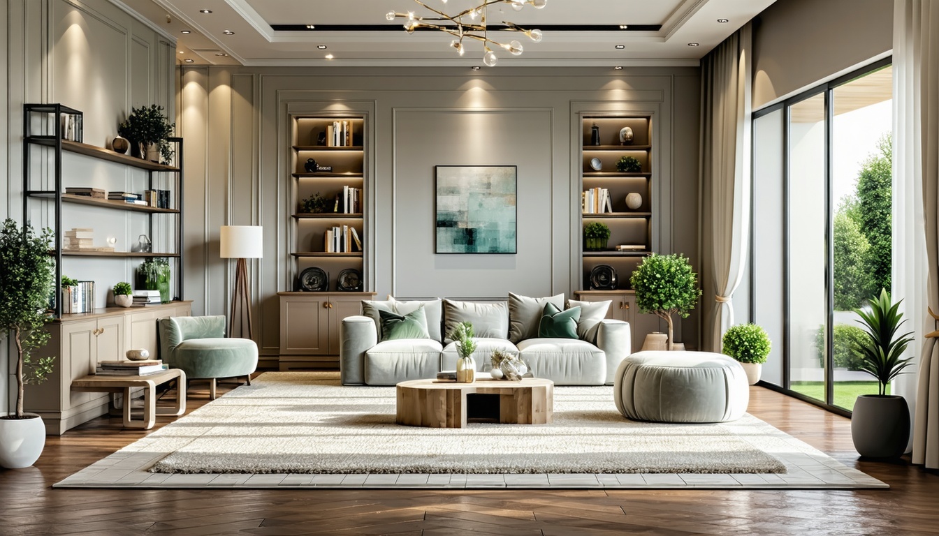
Why Neutral Paint Colors are a Timeless Choice
Neutral paint colors have long been favored in home design for their versatility and timeless appeal. These hues provide a sophisticated backdrop that complements a variety of design styles, from classic to contemporary. By choosing neutral colors, homeowners can create a serene and cohesive environment that stands the test of time.
Additionally, neutral colors enhance the architectural features of a home without overpowering the space. They allow for greater flexibility in decorating, enabling homeowners to easily switch out furnishings and accents without clashing with wall colors. This adaptability is particularly beneficial in custom homes, where personal style may evolve over time.
Understanding the Different Shades of Neutrals
Neutral colors encompass a wide spectrum of shades, each with its unique undertones and characteristics. Common neutral shades include whites, beiges, greys, and taupes. Each of these can range from warm to cool tones, providing different effects and atmospheres in a room.
For instance, warm neutrals such as beige and taupe can create a cozy and inviting ambiance, ideal for living rooms and bedrooms. On the other hand, cool neutrals like grey and white offer a crisp and modern look, perfect for kitchens and bathrooms. Understanding these nuances helps in selecting the right shade to match your desired aesthetic and functional needs.
How to Choose the Right Neutral for Each Room
Selecting the right neutral paint color for each room involves considering the room's purpose, size, and natural light. For living spaces where relaxation is key, warmer neutrals can foster a comforting environment. In contrast, cooler shades might be more suitable for areas requiring a sense of cleanliness and efficiency, such as kitchens and bathrooms.
Additionally, the room's size and light exposure play crucial roles. Smaller rooms can benefit from lighter neutrals to make the space appear larger and more open. In rooms with abundant natural light, cooler neutrals can balance the warmth, while darker neutrals can add depth and drama to well-lit spaces.
The Impact of Lighting on Neutral Paint Colors
Lighting significantly influences how paint colors appear in a room. Natural light changes throughout the day, altering the perception of color. For example, a beige that looks warm and inviting in the morning light might appear dull in the afternoon.
Artificial lighting also affects color perception. Incandescent bulbs tend to cast a warm yellow light that can enhance warm neutrals but might make cool tones look muted. Conversely, LED lights, which often emit cooler light, can make warm neutrals look more balanced and cool neutrals more vibrant. Understanding these effects is essential for achieving the desired look and feel in your custom home.
Tips for Pairing Neutrals with Other Design Elements
Pairing neutral paint colors with other design elements requires a thoughtful approach to create a harmonious aesthetic. One effective method is to use textures and patterns to add interest and depth to neutral walls. For instance, incorporating materials like wood, stone, or metal can enhance the overall design without overwhelming the space.
Another tip is to introduce pops of color through accessories and furnishings. Vibrant throw pillows, artwork, and rugs can provide contrast and personality against a neutral backdrop. Additionally, layering different shades of neutrals can create a sophisticated and cohesive look, ensuring your custom home reflects your unique style while maintaining a timeless appeal.
